See how to apply what we know about notetaking formats to a real notetaking project, i.e., outlining a web site's home page.
In the Getting the big picture of a web site article, we discussed how to get oriented to a new Web site by making organized observations about its home page. In the Notetaking formats article, we described a few different ways you can lay out your notes as well as some best practices to follow.
This article takes concepts from both articles and applies them to a specific notetaking project, i.e., learning about and getting oriented to a new Web site affiliated with this one. You may not be in the habit of taking notes about the Web sites you visit, and probably wouldn’t need to do so beyond your first visit. However, sometimes a few notes about the unique features, organization, or quirks of a particular Web site can help you save time on future visits. Additionally, going through the process described in this article may help you see how notetaking in general can be approached. Keep in mind that you can always adjust the quantity or length of your notes to meet your own needs.
Applying notetaking formats to the MCC AppReviews site
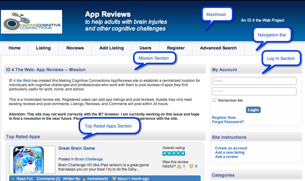
Let’s take a look at the Making Cognitive Connections AppReviews Web site and consider how we might take a few notes about the content and structure of its home page. Here’s a snapshot of the top half of the page with some parts of its structure labeled:

AppReviews Site (Round One)
It’s a good idea to start with the site’s masthead (banner) and then the navigation bar. These are two things that, on most sites anyway, are consistent from page to page. Notice that the masthead identifies the site’s name, its purpose, and its affiliation with ID 4 the Web. Next we notice that the nav bar contains several buttons: Home, Listings, Reviews, Add Listing, Users, Register, and Advanced Search. Since this information already has a bit of a hierarchy to it, we might start with an informal outline (headings plus lists) like this:
- MASTHEAD
- Site Name: Making Cognitive Connections AppReviews
- Site Purpose: To help adults with brain injuries and other cognitive challenges
- Site Affiliations: An ID 4 the Web project
- NAVIGATION BAR
- Home
- Listings
- Reviews
- Add Listing
- Users
- Register
- Advanced Search
AppReviews Site (Round Two)
We’re off to a good start, so let’s see what else is available on the home page. A cursory review shows that the remainder of the page is divided into two columns. The wider column on the left appears to be the main content, while the narrower one on the right appears to be a sidebar. Let’s make those our next two headings in the outline. While we’re at it, let’s identify the main topics within each of those sections. Now our outline has grown:
- MASTHEAD
- Site Name: Making Cognitive Connections AppReviews
- Site Purpose: To help adults with brain injuries and other cognitive challenges
- Site Affiliations: An ID 4 the Web project
- NAVIGATION BAR
- Home
- Listings
- Reviews
- Add Listing
- Users
- Register
- Advanced Search
- MAIN CONTENT
- Mission
- Top-Rated Apps
- New Listings
- SIDEBAR
- My Account (Log-in)
- Site Instructions
- Categories
- Search
- Friends of ID 4 the Web
- Featured Training Items
AppReviews Site (Round Three)
There are many things we could expand upon here, but two things in particular might stand out, especially to a first-time visitor:
- What is the site’s mission (beyond the brief description of purpose in the masthead)?
- What kind of help can I find in the Site Instructions section?
Let’s fill in the outline a bit more by including this additional information in the appropriate sections. Read the Mission section in the main content area and the Site Instructions section in the sidebar, and then see what we’ve added to the outline below:
- MASTHEAD
- Site Name: Making Cognitive Connections App Reviews
- Site Purpose: To help adults with brain injuries and other cognitive challenges
- Site Affiliations: An ID 4 the Web project
- NAVIGATION BAR
- Home
- Listings
- Reviews
- Add Listing
- Users
- Register
- Advanced Search
- MAIN CONTENT
- Mission
- – To establish a centralized location for app reviews to help individuals with cognitive impairments and those who work with them
- – Site is moderated
- – Registered users can list apps and post reviews
- Top-Rated Apps
- New Listings
- Mission
- SIDEBAR
- My Account (Log-in)
- Site Instructions
- – Create an account
- – Add a new listing
- – Add a review
- Categories
- Search
- Friends of ID 4 the Web
- Featured Training Items
Summing it up
So you see the process of notetaking can be as detailed as you like. Depending on your own purpose, you could have stopped after the first round, or after the second or third round. On the other hand, you might want to keep going to gather more details, e.g., what categories of apps are available, or what is involved in the registration process? Perhaps you would have picked other areas to zero in on rather than the ones chosen above. When it comes to the level of detail and the emphasis on particular topics, the important thing is to tailor your notetaking to your own needs and goals. Once you’ve determined that, then following one of the notetaking formats described in this newsletter will help you make your notes readable and useful whenever the need to consult them arises.
