Just as you can get the big picture of a book, you can use a similar strategy to get the big picture of a web site. Doing so will help you meet the specific goals that led you to visit the site in the first place!
In case you are wondering why this particular newsletter includes articles on getting the big picture of a Web site and applying notetaking formats, let me try to explain my reasoning. The previous newsletter featured an article focused on basic notetaking strategies. It provided a few scenarios and described how notetaking might be used to capture important information. It also discussed some of the cognitive skills involved in even the most basic form of notetaking. The article ended with an introduction to the idea of “Getting the Big Picture of a Book.” In essence, getting the big picture (also known as previewing) involves taking just a few minutes to get a sense of a book’s structure and contents and can be very helpful.
We’re going to expand the idea of getting the big picture and apply it to orienting yourself to the look and feel of a Web site. I’m going to focus on ID 4 the Web’s Making Cognitive Connections AppReviews Web site, but these same strategies will work with any Web site. The concept of taking a few minutes to familarize yourself with the organization of a Web site can save you a bunch of time in the long run. One of the problems with Web sites is that they are all different; each one has its own purpose and, therefore, it is organized to suit that particular purpose. The fact that most Web sites don’t share the same look and feel and/or organization can be confusing for a person with a brain injury or other cognitive challenges. For example, if you visit five college Web sites, you will probably find five different looks and five different ways the information is organized and presented.
The purpose of this article is to apply the concept of getting the big picture to Web sites so that they don’t seem so overwhelming and confusing. In the last article, we discussed that the concept of previewing at the book level involves taking a “quick peek” at some of the book’s content and key organizational features, i.e., what is it about and how is it organized? Well, guess what, this same technique can be used to help you get a better idea of a Web site’s purpose, content, and organizational structure. You’ll find that most Web sites tend to use a consistent look and feel throughout the site. So, once you take the time to orient yourself to the site’s content and the way it is organized, you should be able to navigate through the entire site.
Getting the big picture of a Web site requires many of the same cognitive skills discussed in previous Making Cognitive Connections articles (e.g., attention to detail, categorization, visual organization, memory, sequencing, identifying relevant information, etc.). We’re going to go through the process of getting the big picture of a particular Web site to better understand the site’s organizational structure and, as a result, its content.
Making Cognitive Connections AppReviews web site
How many times have you experienced one or more of the following issues when visiting a Web site?
- You can’t find what you are looking for.
- You don’t understand the navigation.
- You get overwhelmed with the sheer amount of information on the screen.
These are common problems many people have when going to a new Web site. Taking a few minutes to get oriented before you dive in can make quite a difference. Below is a picture of the AppReviews home page. This page, like most Web sites, has quite a bit of information on it. However, let’s break the page down to help us get oriented.
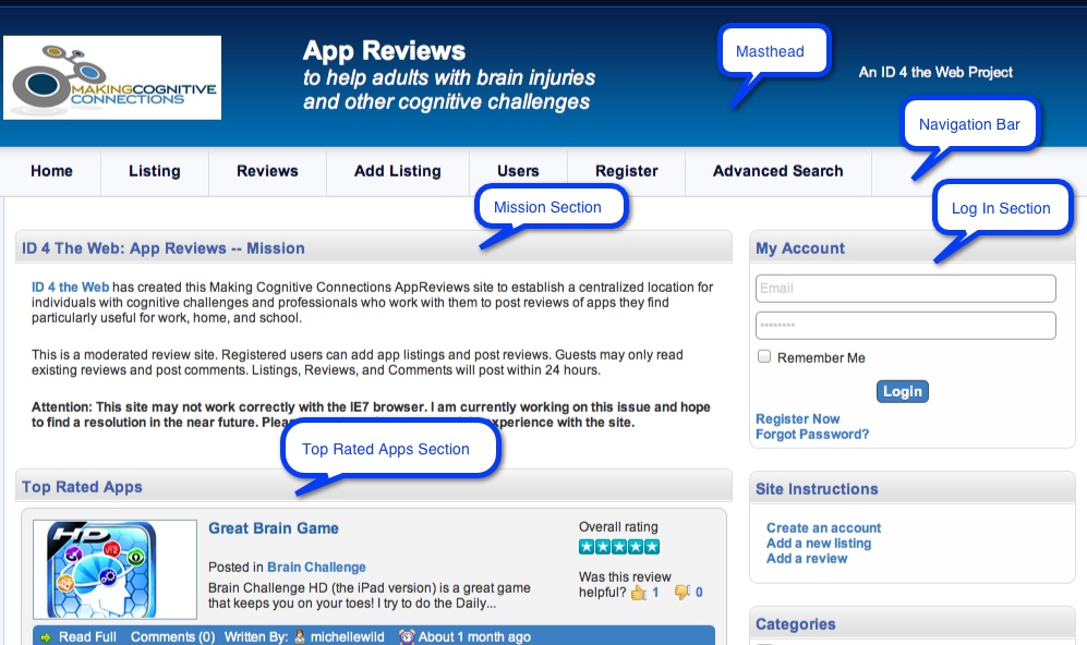
The top of most Web sites includes what many call a masthead. The masthead is a banner composed of graphic images and/or text and is typically located at the top of each Web page in the site. As a result, taking a look at one page should give you a point of reference for the other pages in the site. In our example above, the masthead has the following attributes:
- The Making Cognitive Connections logo on the left side (FYI, clicking the site logo in a masthead will often take you directly to the site’s home page)
- The site name (AppReviews) and a tag line to help understand the purpose of the site
- A reference on the right side to the fact that this site is associated with ID 4 the Web
You will notice that, as I present the information on the Web page, I am employing the strategy of moving sequentially from left to right (this is how we read) and from the top of the page to the bottom. This is an important strategy to use. Many people get lost on a page because they start looking at a random spot that catches their attention, and then continue to glance around the page based on what continues to catch their attention. In this way, the page is never fully discovered or understood as a complete entity.
The next section as we move sequentially down the screen of the AppReviews site is the navigation bar. The nav bar is used to provide the user with links to the Web site’s other pages. The nav bar may be located at the top or on the side of a Web site; however, it should be consistently located from page to page on any given site. Again, looking at the nav bar from left to right or top to bottom is a good idea, just to see what’s available. In our example, the sequence of nav links is: Home, Listing, Reviews, Add Listings, Users, Register, and Advanced Search. Where these links lead should be fairly obvious; however, you might need to click on the Listing button to discover that, in this case, listings refer to apps. As you explore more about the site, you might also learn that, in order to review an app, you have to be looking at its listing; the Review screen only shows those apps that have already been reviewed. During your preview of the site navigation, you might also realize that all the nav links may not be relevant to you right now. For example, at this point, you may not have any plans to add an app listing to the site.
As we move down through the Web page, we see that the main content area (the area below the nav bar) is divided into sections, e.g., the Mission section, the Login section, the Top Rated App section, and the Site Instructions section. It is important to note the sections that are most relevant to you and your current purpose for visiting the site. What is relevant may change along with your purpose as you revisit the site from time to time. For instance, you might read the Mission section or use the Site Instructions section on your first visit or two to the site, take a few notes, and then not revisit those sections on a regular basis. Instead, you might use the notes you took on how to use the site rather than continue to read the instructions each time you visit the site—at least until you can remember the specifics.
If you were to visit the actual AppReviews Web site, you would see a New Listing section as you move down the Web page. How is that section different from the Top Rated Apps section? Can you get a sense of when you’d want to check out one versus the other? There is also a Categories section on the right side of the page. You’ll probably notice how many different categories of apps there are listings for, and begin to think about which categories you are most interested in right now. The point is this: By the time you’ve gotten the big picture of this Web site—its layout, its navigation, its home page’s main sections—you are much more prepared to be an intelligent consumer of the information located there. You know what’s available, and you are ready to plunge in to meet your current needs and goals.